Plotting
Intake provides a plotting API based on the hvPlot library, which closely mirrors the pandas plotting API but generates interactive plots using HoloViews and Bokeh.
The hvPlot website provides comprehensive documentation on using the plotting API to quickly visualize and explore small and large datasets. The main features offered by the plotting API include:
Support for tabular data stored in pandas and dask dataframes
Support for gridded data stored in xarray backed nD-arrays
Support for plotting large datasets with datashader
Using Intake alongside hvPlot allows declaratively persisting plot declarations and default options in the regular catalog.yaml files.
Setup
For detailed installation instructions see the getting started section in the hvPlot documentation. To start with install hvplot using conda:
conda install -c conda-forge hvplot
or using pip:
pip install hvplot
Usage
The plotting API is designed to work well in and outside the Jupyter notebook, however when using it in JupyterLab the PyViz lab extension must be installed first:
jupyter labextension install @pyviz/jupyterlab_pyviz
For detailed instructions on displaying plots in the notebook and from the Python command prompt see the hvPlot user guide.
Python Command Prompt & Scripts
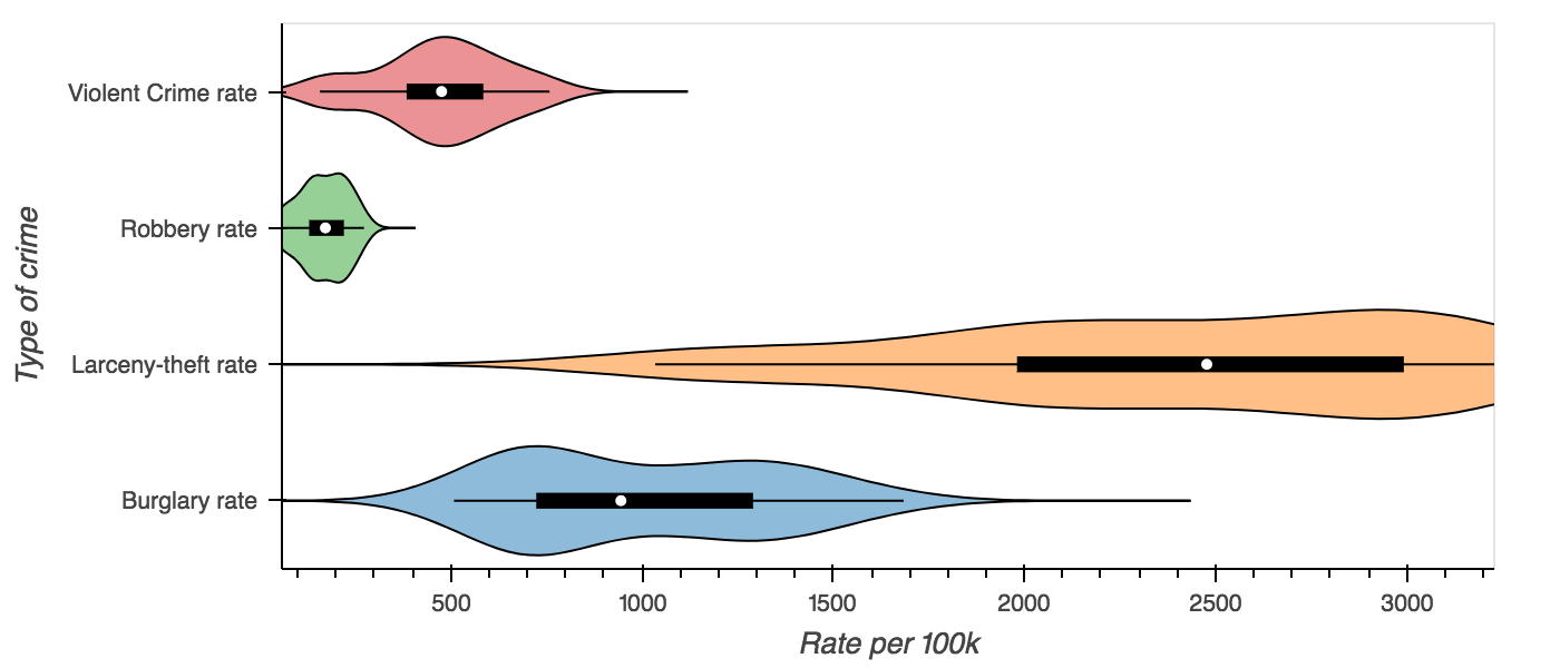
Assuming the US Crime dataset has been installed (in the intake-examples repo, or from conda with conda install -c intake us_crime):
Once installed the plot API can be used, by using the .plot method on an intake DataSource:
import intake
import hvplot as hp

crime = intake.cat.us_crime
columns = ['Burglary rate', 'Larceny-theft rate', 'Robbery rate', 'Violent Crime rate']

violin = crime.plot.violin(y=columns, group_label='Type of crime',
                           value_label='Rate per 100k', invert=True)
hp.show(violin)
Notebook
Inside the notebook plots will display themselves, however the notebook extension must be loaded first. The
extension may be loaded by importing hvplot.intake module or explicitly loading the holoviews extension,
or by calling intake.output_notebook():
# To load the extension run this import
import hvplot.intake

# Or load the holoviews extension directly
import holoviews as hv
hv.extension('bokeh')

# convenience function
import intake
intake.output_notebook()

crime = intake.cat.us_crime
columns = ['Violent Crime rate', 'Robbery rate', 'Burglary rate']
crime.plot(x='Year', y=columns, value_label='Rate (per 100k people)')
Predefined Plots
Some catalogs will define plots appropriate to a specific data source. These will be specified such that the user gets the right view with the right columns and labels, without having to investigate the data in detail – this is ideal for quick-look plotting when browsing sources.
import intake
intake.us_crime.plots
Returns [‘example’]. This works whether accessing the entry object or the source instance. To visualise
intake.us_crime.plot.example()
Persisting metadata
Intake allows catalog yaml files to declare metadata fields for each data source which are made available alongside the actual dataset. The plotting API reserves certain fields to define default plot options, to label and annotate the data fields in a dataset and to declare pre-defined plots.
Declaring defaults
The first set of metadata used by the plotting API is the plot field in the metadata section. Any options found in the metadata field will apply to all plots generated from that data source, allowing the definition of plotting defaults. For example when plotting a fairly large dataset such as the NYC Taxi data, it might be desirable to enable datashader by default ensuring that any plot that supports it is datashaded. The syntax to declare default plot options is as follows:
sources:
  nyc_taxi:
    description: NYC Taxi dataset
    driver: parquet
    args:
      urlpath: 's3://datashader-data/nyc_taxi_wide.parq'
    metadata:
      plot:
        datashade: true
Declaring data fields
The columns of a CSV or parquet file or the coordinates and data variables in a NetCDF file often have shortened, or cryptic names with underscores. They also do not provide additional information about the units of the data or the range of values, therefore the catalog yaml specification also provides the ability to define additional information about the fields in a dataset.
Valid attributes that may be defined for the data fields include:
label: A readable label for the field which will be used to label axes and widgets
unit: A unit associated with the values inside a data field
range: A range associated with a field declaring limits which will override those computed from the data
Just like the default plot options the fields may be declared under the metadata section of a data source:
sources:
  nyc_taxi:
    description: NYC Taxi dataset
    driver: parquet
    args:
      urlpath: 's3://datashader-data/nyc_taxi_wide.parq'
    metadata:
      fields:
        dropoff_x:
          label: Longitude
        dropoff_y:
          label: Latitude
        total_fare:
          label: Fare
          unit: $
Declaring custom plots
As shown in the hvPlot user guide, the plotting API provides a variety of plot types, which can be declared using the kind argument or via convenience methods on the plotting API, e.g. cat.source.plot.scatter(). In addition to declaring default plot options and field metadata data sources may also declare custom plot, which will be made available as methods on the plotting API. In this way a catalogue may declare any number of custom plots alongside a datasource.
To make this more concrete consider the following custom plot declaration on the plots field in the metadata section:
sources:
  nyc_taxi:
    description: NYC Taxi dataset
    driver: parquet
    args:
      urlpath: 's3://datashader-data/nyc_taxi_wide.parq'
    metadata:
      plots:
        dropoff_scatter:
          kind: scatter
          x: dropoff_x
          y: dropoff_y
          datashade: True
          width: 800
          height: 600
This declarative specification creates a new custom plot called dropoff_scatter, which will be available on the catalog under cat.nyc_taxi.plot.dropoff_scatter(). Calling this method on the plot API will automatically generate a datashaded scatter plot of the dropoff locations in the NYC taxi dataset.
Of course the three metadata fields may also be used together, declaring global defaults under the plot field, annotations for the data fields under the fields key and custom plots via the plots field.